左下边框圆角
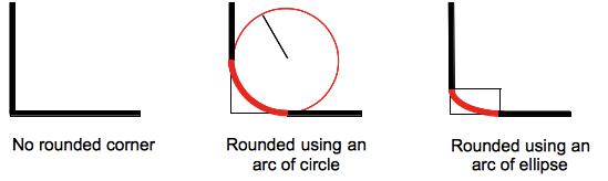
border-bottom-left-radius 这个 css 属性设置元素左下角的圆角。圆角可以是圆或椭圆(注:应为圆或椭圆的一部分),或者当其中一个值为 0 时,圆角将不被设置,这时这个角将展示为直角。
一个无论是图像或颜色的背景,都会在边框上被裁剪,即使背景是圆角的; 裁剪的确切位置由 background-clip 属性定义。
备注: 如果该属性的值没有被一个在**border-bottom-left-radius** 属性后,作用于当前元素上的border-radius简写属性设置,那么该属性值将会被shorthand property重置为初始值。
| 初始值 | 0 |
|---|---|
| 适用元素 | all elements; but User Agents are not required to apply to table and inline-table elements when border-collapse is collapse. The behavior on internal table elements is undefined for the moment.. It also applies to ::first-letter. |
| 是否是继承属性 | 否 |
| Percentages | refer to the corresponding dimension of the border box |
| 计算值 | two absolute lengths or percentages |
| Animation type | a length, percentage or calc(); |
语法
/* 圆形 */
/* border-bottom-left-radius: radius */
border-bottom-left-radius: 3px;

/* 椭圆形 */
/* border-bottom-left-radius: 水平方向 垂直方向 */
border-bottom-left-radius: 0.5em 1em;

border-bottom-left-radius: inherit;
where:
- radius
-
Is a
<length>or a<percentage>denoting the radius of the circle to use for the border in that corner. - horizontal
-
Is a
<length>or a<percentage>denoting the horizontal semi-major axis of the ellipsis to use for the border in that corner. - vertical
-
Is a
<length>or a<percentage>denoting the vertical semi-major axis of the ellipsis to use for the border in that corner.
Values
<length-percentage>-
Denotes the size of the circle radius or the semi-major and semi-minor axes of the ellipsis. As absolute length it can be expressed in any unit allowed by the CSS
<length>data type. Percentages for the horizontal axis refer to the width of the box, percentages for the vertical axis refer to the height of the box. Negative values are invalid.
Formal syntax
border-bottom-left-radius =
  <length-percentage [0,∞]>{1,2}

<length-percentage> =
  <length>      |
  <percentage>
Examples
| Live example | Code |
|---|---|
|
.
|
An arc of circle is used as the border
css |
|
.
|
An arc of ellipse is used as the border
css |
|
.
|
The box is a square: an arc of circle is used as the border
css |
|
.
|
The box is not a square: an arc of ellipse is used as the border
css |
|
.
|
The background color is clipped at the border
css |
Specifications
| Specification |
|---|
| CSS Backgrounds and Borders Module Level 3 # border-radius |
Browser compatibility
BCD tables only load in the browser
See also
The border-radius-related CSS properties: the CSS shorthand border-radius, the properties for the other corners: border-top-right-radius, border-bottom-right-radius (en-US), and border-top-left-radius.