HTML表格的基礎
什麼是表格?
表格是一個由列和欄組成的結構化資料(tabular data)。表格能幫助你快速查看不同資料類型間的關聯值。例如人和年紀、一周當中的某天或是地方游泳池的時間表。
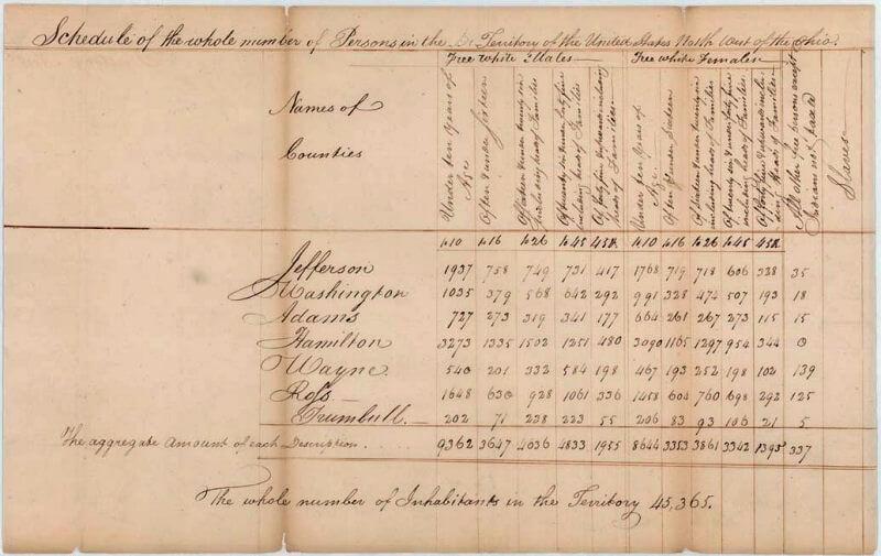
表格在人類社會當中被廣泛使用且已經有很久的歷史,如下是美國 1800 年的人口普查紀錄表格。
這也難怪 HTML 的開創者要提供一個在網路建立和呈現表格化資料的方法。
表格是怎麼運作的呢?
表格是精確的,資訊可以透過列和欄位名稱之間的視覺關聯輕鬆呈現。觀察以下表格,利用列和欄目名稱找出有 62 個衛星的類木行星。
有關太陽系星球的資訊 (真實資料取自 Nasa's Planetary Fact Sheet - Metric. )
| 名稱 | 質量(1024kg) | 直徑 (km) | 密度(kg/m3) | 重力(m/s2) | 一天的長度(小時) | 和太陽的距離(106km) | 平均溫度 (°C) | 衛星的數目 | 備註 | ||
|---|---|---|---|---|---|---|---|---|---|---|---|
| 陸地行星 | 水星 | 0.330 | 4,879 | 5427 | 3.7 | 4222.6 | 57.9 | 167 | 0 | 最接近太陽 | |
| 金星 | 4.87 | 12,104 | 5243 | 8.9 | 2802.0 | 108.2 | 464 | 0 | |||
| 地球 | 5.97 | 12,756 | 5514 | 9.8 | 24.0 | 149.6 | 15 | 1 | 我們的世界 | ||
| 火星 | 0.642 | 6,792 | 3933 | 3.7 | 24.7 | 227.9 | -65 | 2 | 紅色星球 | ||
| 類木行星 | 氣態巨行星 | 木星 | 1898 | 142,984 | 1326 | 23.1 | 9.9 | 778.6 | -110 | 67 | 最大的星球 |
| 土星 | 568 | 120,536 | 687 | 9.0 | 10.7 | 1433.5 | -140 | 62 | |||
| 冰質巨行星 | 天王星 | 86.8 | 51,118 | 1271 | 8.7 | 17.2 | 2872.5 | -195 | 27 | ||
| 海王星 | 102 | 49,528 | 1638 | 11.0 | 16.1 | 4495.1 | -200 | 14 | |||
| 矮行星 | 冥王星 | 0.0146 | 2,370 | 2095 | 0.7 | 153.3 | 5906.4 | -225 | 5 | 在2006年被從行星類別中除名,但這還些爭議。 | |
在正確執行之下,就連視障者都可以把表格資料詮釋為 HTML 格式的表格。一份成功的 HTML 表格就應該如此提升視障者的使用經驗。
表格樣式
你也可以在 GitHub 上看看實際範例 ! 而你也許會注意到那裡的表格似乎更容易閱讀。那是因為這裡的表格只有加上很少樣式,而 GitHub 上的版本卻應用上了更多明顯的 CSS 。
需要弄清楚的一點是 : 要讓表格在網頁上有效呈現需要提供紮實的 HTML 架構和 CSS 樣式資訊,但將在這個模組中聚焦在 HTML 的部分。若想瞭解 CSS 的部分,可以在完成這部分閱讀之後造訪表格樣式設計 (en-US)的文章。
在這個單元裡我們將不會聚焦在 CSS 上,但是我們提供基本的 CSS 樣式表讓你做使用,這將會使你製作的表格比起毫無修飾的預設樣式更方便閱讀。你能在這找到樣式表,並且你也能找到一個適用於樣式表的HTML 模版 — 他們能一起讓你有個好起點來實驗 HTML 表格。
當何時你不應該使用 HTML 表格?
HTML 表格應該被使用在結構化資料(tabular data)上 — 這就是它們被設計的目的。 不幸地是,許多人習慣使用 HTML 表格去排版他們的網頁,例如: 使用一列去當 header,一列當做內容欄位,一列當作 footer...等等,你能在我們的輔助學習單元裡的頁面輸出 (en-US)發現更多細節以及一個範例。它曾經被這麼使用是因為 CSS 過去在不同瀏覽器之間的支援程度十分可怕; 如今,已非常少在用表格做排版,但你仍然可能在網路的一些邊邊角角見到。
簡單來說,使用表格排版而非使用CSS 排版技術是一件很糟的事情。 下列是主要原因:
- 表格排版會減少對視障使用者的輔助 : 視障者使用的螢幕閱讀器 (en-US)會翻譯存在於 HTML 網頁的標籤並對使用者念出內容。由於表格並不是正確的排版工具,並且標示方式遠複雜於 CSS 排版技術,所以螢幕閱讀器輸出的內容會使他們的使用者感到困惑。
- 表格會產生標籤雜燴(tag soup): 就像上面提到的,表格排版通常會比一般適當的輸出技術包含更複雜的標籤結構。這會導致程式碼本身更難撰寫、維護及 debug。
- 表格不會自適應(automatically responsive): 當你使用合適的排版容器(像是{htmlelement("header")},
<section>) 或是<div>),它們的寬度相對於父層預設為 100%,而表格的預設大小是依據它們的內容物,所以當表格樣式要有效的在不同的裝置之間運行時,會需要做額外的測量調整。
主動學習:建造你第一個表格
關於表格的理論我們已經談論夠了,所以,來深入實際的例子並建立一個簡單的表格吧!
- 第一件事,在自己的電腦複製一份新的空白模板.html 以及 簡易表格.css
- 每一個表格裡的內容都是由這兩個標籤所組成:
<table></table>將這些放入你的 HTML 中的 body。 - 表格裡最小的容器是表格儲存格,由**
<td>(en-US)**元素所組成('td' 代表 'table data')。將下列的程式碼加入你的表格標籤之中:html<td>Hi, I'm your first cell.</td> -
如果我們想要一個四格儲存格寬的列(row), 我們需要複製這些標籤三次。
將你的表格內容更新成這樣:
html
<td>Hi, I'm your first cell.</td>
<td>I'm your second cell.</td>
<td>I'm your third cell.</td>
<td>I'm your fourth cell.</td>
就像你看到的,儲存格不會在各自的下方,它們彼此自動排列在同一列上。每個 <td> 元素會創造單個儲存格並且使它們據在同一行,我們新增的每一個儲存格都會使列更長。
要讓這個列停止增加並開始在下一列增加連續的儲存格的話,我們需要用 <tr> (en-US) 元素 ('tr' 代表 'table row'),現在來探討一下:
- 放置四個你已新增在
<tr>標籤裡的儲存格, 像這樣:html<tr> <td>Hi, I'm your first cell.</td> <td>I'm your second cell.</td> <td>I'm your third cell.</td> <td>I'm your fourth cell.</td> </tr> - 現在你已經製作了一列了,可以再繼續做一、二列 — 每個列都需要被額外的
<tr>元素包裹住, 並且每個儲存格都須包含在一個<td>內
結果
用 <th> 加上標頭元素
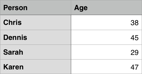
現在,讓我們把注意力轉移到表格的標頭(table header) — 存在於一列或一欄開頭的特別儲存格並且定義了欄或列中內容的資料型態 (舉個例子, 看看這篇文章中第一個範例裡 的"Person" 和 "Age" 儲存格 )。 為了說明為什麼它們很有用,請看下面的表格例子, 首先是程式碼:
<table>
<tr>
<td> </td>
<td>Knocky</td>
<td>Flor</td>
<td>Ella</td>
<td>Juan</td>
</tr>
<tr>
<td>Breed</td>
<td>Jack Russell</td>
<td>Poodle</td>
<td>Streetdog</td>
<td>Cocker Spaniel</td>
</tr>
<tr>
<td>Age</td>
<td>16</td>
<td>9</td>
<td>10</td>
<td>5</td>
</tr>
<tr>
<td>Owner</td>
<td>Mother-in-law</td>
<td>Me</td>
<td>Me</td>
<td>Sister-in-law</td>
</tr>
<tr>
<td>Eating Habits</td>
<td>Eats everyone's leftovers</td>
<td>Nibbles at food</td>
<td>Hearty eater</td>
<td>Will eat till he explodes</td>
</tr>
</table>
這是實際渲染出的表格:
這裡的問題在於,當你找到想知道的資料時,並不容易去找到資料之間對應的位置。如果欄跟列能有個明顯的標示,會比較好理解。
主動學習 : 表格標頭
讓我們來繼續改善這個表格吧!
- 首先, 複製 dogs-table.html and minimal-table.css 檔案到你的電腦。 這份 HTML 裡包含跟底下你看到的一樣的狗狗範例。
-
為了在語意上和視覺上辨識表格的標頭,你可以使用
<th>(en-US) 元素 ('th' 代表 'table header')。它的運作方式跟<td>完全相同,除了它表示的是標頭而非一般儲存格外。 繼續修改你的 HTML 將所有外圍的<td>元素變成<th>元素。 - 儲存你的 HTML 並在瀏覽器上執行,現在你應該可以看到標頭應有的樣子。
備註: 你可以在 GitHub 上的dogs-table-fixed.html找到我們寫好的完整的範例(直接看看長怎樣).
標頭為什麼實用?
我們已經部分解答了這個問題 — 當有標頭清楚標示時,它能更簡單的使你找到資料並讓整體設計看起來更完整。
備註: 表格標頭有具備預設樣式 — 粗體並置中,即使你不加上你自己的表格樣式,他們仍然能被凸顯。
表格標頭還有一個額外的好處 — 伴隨著 作用域(scope) 屬性 (我們將會在下一個章節中學到),當要連結每個標頭而所有資料都在同一列或欄時,這能允許表格使用起來更無障礙。並且,螢幕閱讀器能一次性讀出完整一列或一欄的資料,這是非常實用的。
允許列或欄的儲存格合併
有時我們想要儲存格涵蓋複數的列或欄,來看看下列顯示常見動物名稱的簡單例子。在某些案例,我們想要將名字代表雄性或雌性顯示在動物名字旁邊,但有些不需要,這種情況下我們只想將動物名字橫跨整個表格。
初始架構會看起來像這樣:
<table>
  <tr>
    <th>Animals</th>
  </tr>
  <tr>
    <th>Hippopotamus</th>
  </tr>
  <tr>
    <th>Horse</th>
    <td>Mare</td>
  </tr>
  <tr>
    <td>Stallion</td>
  </tr>
  <tr>
    <th>Crocodile</th>
  </tr>
  <tr>
    <th>Chicken</th>
    <td>Hen</td>
  </tr>
  <tr>
    <td>Rooster</td>
  </tr>
</table>
但輸出的不如我們想要的樣子:
我們需要一種方式讓"Animals", "Hippopotamus", 和 "Crocodile" 橫跨兩個欄位, 然後讓 "Horse" and "Chicken" 向下合併兩列儲存格。幸運地是,表格標頭和儲存格有 colspan 和 rowspan 屬性,可以讓我們這樣做。 兩者都接受無單位的數值等同於你想合併的列或欄的數量。舉例來說,colspan="2" 會讓這個儲存格合併兩欄。
來使用 colspan 和 rowspan 來改善這麼表格吧!
- 首先,複製一份我們的 animals-table.html 和 minimal-table.css 檔案在你的電腦上。這個 HTML 包含跟上面同樣的動物範例。
- 接著,使用
colspan來讓 "Animals", "Hippopotamus", 和 "Crocodile" 合併橫跨兩個欄位。 - 最後, 使用
rowspan來讓 "Horse" and "Chicken" 合併橫跨兩列。 - 儲存並在瀏覽器上檢視你改善後的程式碼。
備註: 你可以在 GitHub 上的 animals-table-fixed.html 找到我們寫好的完整的範例 (see it live also).
Providing common styling to columns
Styling without <col>
在我們繼續下去前,我們將要告訴你這節文章最後一個重點。HTML 有一個一次定義一整欄樣式資訊的方法 — <col> <colgroup> 元素。These exist because it can be a bit annoying and inefficient having to specify styling on columns — you generally have to specify your styling information on every <td> or <th> in the column, or use a complex selector such as :nth-child() (en-US).
備註: Styling columns like this is limited to a few properties: border (en-US), background (en-US), width, and visibility (en-US). To set other properties you'll have to either style every <td> or <th> in the column, or use a complex selector such as :nth-child() (en-US).
Take the following simple example:
<table>
  <tr>
    <th>Data 1</th>
    <th style="background-color: yellow">Data 2</th>
  </tr>
  <tr>
    <td>Calcutta</td>
    <td style="background-color: yellow">Orange</td>
  </tr>
  <tr>
    <td>Robots</td>
    <td style="background-color: yellow">Jazz</td>
  </tr>
</table>
Which gives us the following result:
This isn't ideal, as we have to repeat the styling information across all three cells in the column (we'd probably have a class set on all three in a real project and specify the styling in a separate stylesheet).
Styling with <col>
Instead of doing this, we can specify the information once, on a <col> element. <col> elements are specified inside a <colgroup> container just below the opening <table> tag. We could create the same effect as we see above by specifying our table as follows:
<table>
  <colgroup>
    <col />
    <col style="background-color: yellow" />
  </colgroup>
  <tr>
    <th>Data 1</th>
    <th>Data 2</th>
  </tr>
  <tr>
    <td>Calcutta</td>
    <td>Orange</td>
  </tr>
  <tr>
    <td>Robots</td>
    <td>Jazz</td>
  </tr>
</table>
Effectively we are defining two "style columns", one specifying styling information for each column. We are not styling the first column, but we still have to include a blank <col> element — if we didn't, the styling would just be applied to the first column.
If we wanted to apply the styling information to both columns, we could just include one <col> element with a span attribute on it, like this:
<colgroup>
  <col style="background-color: yellow" span="2" />
</colgroup>
Just like colspan and rowspan, span takes a unitless number value that specifies the number of columns you want the styling to apply to.
Active learning: colgroup and col
Now it's time to have a go yourself.
Below you can see the timetable of a languages teacher. On Friday she has a new class teaching Dutch all day, but she also teaches German for a few periods on Tuesday and Thursdays. She wants to highlight the columns containing the days she is teaching.
Recreate the table by following the steps below.
- First, make a local copy of our timetable.html file in a new directory on your local machine. The HTML contains the same table you saw above, minus the column styling information.
- Add a
<colgroup>element at the top of the table, just underneath the<table>tag, in which you can add your<col>elements (see the remaining steps below). - The first two columns need to be left unstyled.
- Add a background color to the third column. The value for your
styleattribute isbackground-color:#97DB9A; - Set a separate width on the fourth column. The value for your
styleattribute iswidth: 42px; - Add a background color to the fifth column. The value for your
styleattribute isbackground-color: #97DB9A; - Add a different background color plus a border to the sixth column, to signify that this is a special day and she's teaching a new class. The values for your
styleattribute arebackground-color:#DCC48E; border:4px solid #C1437A; - The last two days are free days, so just set them to no background color but a set width; the value for the
styleattribute iswidth: 42px;
See how you get on with the example. If you get stuck, or want to check your work, you can find our version on GitHub as timetable-fixed.html (see it live also).
Summary
That just about wraps up the basics of HTML Tables. In the next article we will look at some slightly more advanced table features, and start to think how accessible they are for visually impaired people.